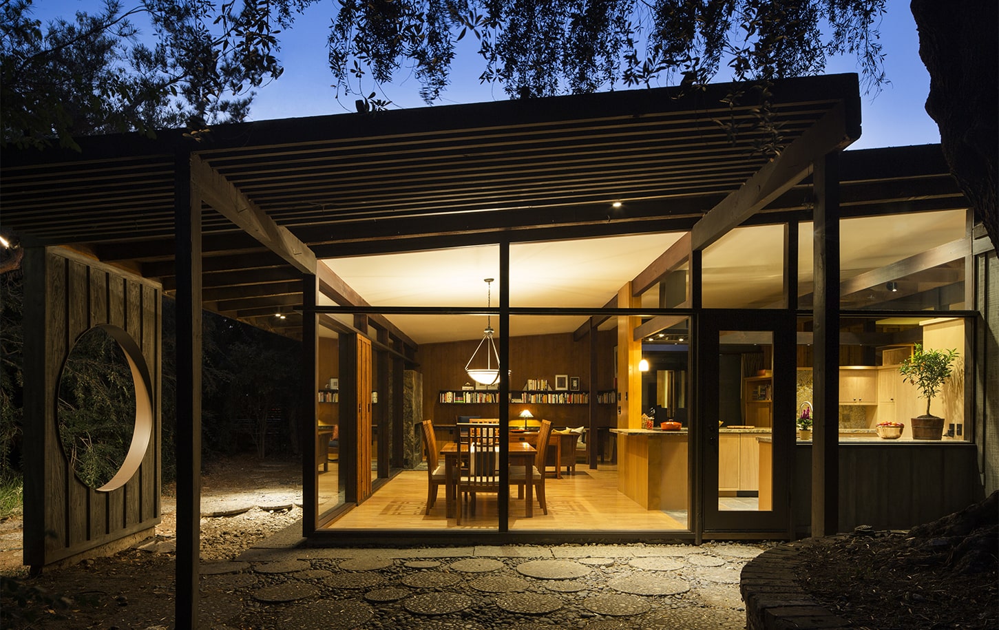
Fall In Love With Mid-Century Modern Home In Claremont
This Mid-Century Modern, Post & Beam style home needed a major redesign to better accommodate modern living while preserving the features that make this home so special. The HartmanBaldwin team developed a multi-phase plan that honored the distinctive architectural style, reinvigorated outdated spaces, and expanded the home through carefully thought-out additions. The comprehensive, multi-phase design plan affected both the public and private areas of the home. In the first phase, our team focused on the remodeling and expansion of the new primary suite. The next several phases included major system updates, and remodeling of the kitchen, adjacent living areas, guest suite, and home office. The last phase of the master plan included a remodel of the carport and guest house.
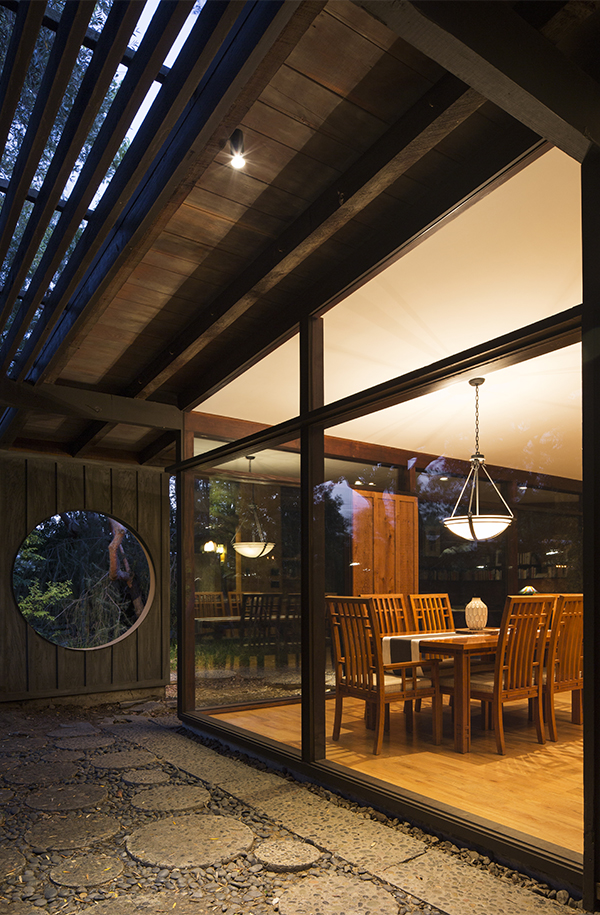
Scope of Project
Phase 1: Master Suite Addition, New Study and Laundry Room
Phase 2: New Roofing, Lighting and Plumbing
Phase 3: Kitchen and Bath Remodel
Phase 4: Guest Bedroom, Office and Entry Remodel
Phase 5: Guest House Remodel
Architectural Style
Mid-Century Modern
Size of Home
2,990 Sq. Ft.
As you approach the home, you’re greeted with a custom, pivot entry door, a true work of art that highlights the natural patterns of the walnut and ash olive wood. Upon entering, a beautiful live-wood shelf, hand-made by artisans at the Maloof Foundation blends art and function. Beneath your feet, a dark slate tile gives way to the new white oak flooring that richly complements the rest of the elegant yet simple wood detailing of the remodeled kitchen and living room. We’ll get to the kitchen and living room in a bit, first, let’s take a look at the major redesign of the Primary Suite.
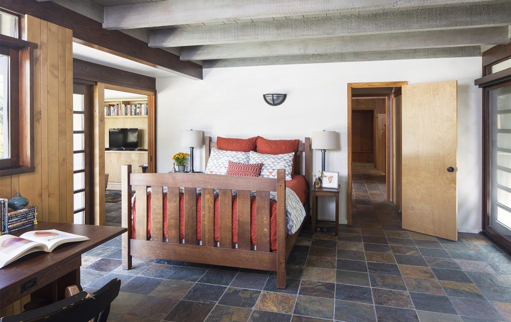
The existing layout allocated a larger space for the bathroom than the bedroom and to access its bathroom, one would have to walk through a hall and closet. With the help of our expert design team, an addition of 170 square feet allowed for a far improved floor plan. The new layout converted that hallway and closet into a convenient and spacious laundry room. Allowing for the existing bedroom to now be a smaller sitting room that directly connects to the larger primary bedroom and ensuite, extending the room’s functional space. The new suite has a more private space for the new water closet, sunken shower, bathroom vanity, as well as a large walk-in closet. This expansion also provided our clients with more indoor-outdoor seating areas like the one between the living room and bedroom. A quiet little space that overlooks the lush backyard, perfect for a little reflection or reading time. The large sliding doors on both sides of the room are not only beautiful features but also help flood the room with natural light. One side overlooks the backyard and the other looks at the newly remodeled pool area and patio.
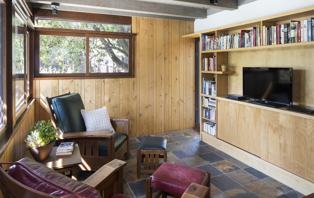
Movement flows organically between the bedroom, spa-like bathroom, sitting room, and outdoor spaces. New slate tile flooring throughout the entire wing enhances the continuity of earth tones and textures as in the cabinetry and exposed wood beams. A new window on the north wall was carefully crafted to match the timeless charm of the existing windows, ensuring that the home’s character remained intact. Within the sitting room, custom cabinetry showcases quality craftsmanship and a large pocket door offers additional privacy when needed. This is a prime example of where style meets functionality, and every detail is designed to elevate the living experience.
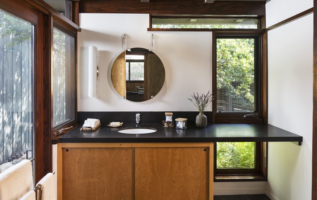
While the shower retained its original location the newly redesigned ensuite bathroom now provides a private vanity area and water closet. The circle mirror is a nice play against the geometric lines and elements throughout the home, like the circular accents of the exterior.
As we re-enter the main living area, we see the fireplace maintain its bold placement on the wall of windows, with a pretty notable difference… its brick façade was wrapped with gorgeous granite to better complement the other textures throughout the home and introduce striking patterns. The existing slider to the left of the fireplace was removed to create a clean, seamless wall of floor-to-ceiling windows that frame the lush backyard landscape. The single-pane windows have been replaced with energy-efficient dual-paned fixed windows that unite the living room with the adjoining dining room and kitchen. It’s a symphony of design that marries the indoors with the outdoors, embracing the spirit of mid-century modern architecture.
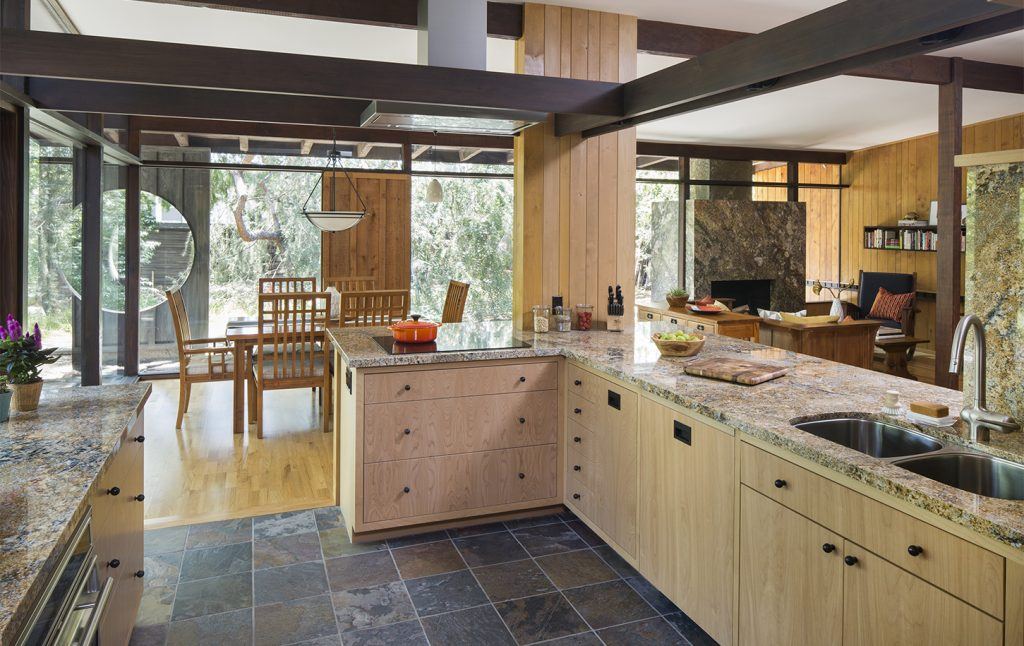
The kitchen’s remarkable transformation is a true masterpiece of design. The previous kitchen was heavily compartmentalized with bulky upper cabinets that interrupted the views of the exterior and adjacent spaces. The remodeled kitchen now features plenty of custom birch cabinetry around the lower perimeter, giving clear sight lines to the dining room, living room, and the beauty of the outdoors. The subtle tone of the new stone countertop and backsplash brightens the room with the help of abundant natural light. As you gaze upward, the exposed beams and clerestory windows bring dynamic rhythm, contrast, and personality to the space, fully embodying the heart of the home’s architectural identity.
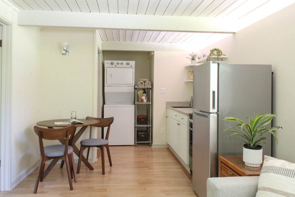
The final phase of this remodel focused on the guest house and garage. The garage was modified by removing the 2 dated rolling doors and hardware, creating a carport and more comfortable access to parking and entrance to the guest house.
Inside the guest house, a short wall that once segmented the living area and kitchenette was demolished to create a more open floor plan. In a smaller kitchen, like this one, making use of all the perimeter wall space makes the room feel much bigger. From the floating shelves to the washer/dryer alcove to the upgraded clerestory and other windows in the guest house all of it was with light and space in mind. Motorized shades add a convenient feature that allows guests to adjust for privacy. The remodeled guest house now has all new appliances, fixtures, lighting, and an upgraded heating and ventilation system that were added in this phase of the project.
To see more of this transformation with drastic before and after comparisons, take a look at our featured video spotlight!

